|
There are several design goals in the optimization process:
- Increase color gamut area coverage (% NTSC); even if it does not have a direct connection with image quality, it is still the industry benchmark;
- Increase brightness at the desired white point;
- Get a good color intensity distribution.
The first two parameters are also considered in the design of RGB displays and they are well known and understood. However, the intensity distribution consideration is unique for multi-primary displays. In RGB displays the relative intensities of the primaries are determined by their color coordinates and the white point. In multi-primary displays, it is possible to get the same white color temperature with different combinations of the primaries. Another way to look at this issue is by considering the relative intensities of the pure RGB primaries. For example, in RGB displays, the relative intensity of the green primary is ~70% of the white intensity. In multiprimary displays, given that the relative green aperture ratio is lower and the absolute green intensity may also be lower (more saturated color), yet the overall white brightness is higher, it becomes clear that the relative green brightness cannot be as high as in RGB displays - actually it is much lower. Thus, in the design of the displays, we had to develop our own criteria of intensity distribution to get good image quality.
In this process of intensity distribution optimization, we considered two main factors:
(a) intensities of "saturated" natural colors;
(b) intensity distribution in cinema images.
Let us first consider natural images. In the diagram below we show some representative reflection spectrums of saturated natural colors.
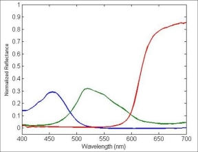
The maximum intensity of saturated green and blue colors is very low. Thus, the relative brightness of saturated green and blue colors is much lower than in the EBU or NTSC RGB displays. For example, saturated green brightness is only approximately 20%, vs. the 70% in RGB displays. For the blue colors, saturated blue intensities are around 1-3%, vs. the ~10% in RGB TV. Therefore, it is clear that for good image appearance, there is no need to have the high intensities of the green and blue colors that exist in TV. The only reason that TV has these high intensities is to get the required brightness in the non-saturated and white colors, and also in the very high brightness saturated yellow and orange colors.
Saturated red colors can have relatively high intensities (even though, still lower than the relative intensity in TV). Since there is a trade-off between red saturation and intensity, and the red intensity may be a limiting factor, Genoa together with Philips Research Laboratories engaged in an extensive research project to investigate and optimize red saturation and intensity.
It should be noted that saturated yellow and orange colors also have very high intensity (saturated natural yellow colors reflection is close to 100%). We found that one of the most important factors in image appearance quality is saturation and intensity of these colors. In this case there is almost no compromise - highly saturated bright yellow and orange colors will always improve image quality substantially.
A more quantitative intensity distribution design is comparison with cinema gamut. Comparison with cinema gamut is a standard part of the gamut design process. Genoa has found that by careful design of multiprimary displays, we can accurately replicate the three dimensional color gamut (including color intensity distribution) of cinema, enabling a "true cinema-like" viewing experience.
Genoa Color TV, in collaboration with its partners in the LCD industry, has succeeded in the design and development of four- and five-primary displays that enable very good, cost-effective performance.
Next
|